The date, time, and datetime question types capture date and/or time values. rtSurvey renders them with several layout modes controlled by the appearance column.
Basic XLSForm Specification
| type | name | label |
|---|---|---|
| date | birth_date | Date of birth |
| time | start_time | What time did it start? |
| datetime | event_datetime | When did the event occur? |
For the standard specification see the XLSForm documentation (opens in a new tab).
Layout modes
Default — always-open calendar
No appearance value needed. The calendar (and clock for time/datetime) renders directly on the page — always visible, no button required.
| type | name | label | appearance |
|---|---|---|---|
| date | start_date | Date of visit |
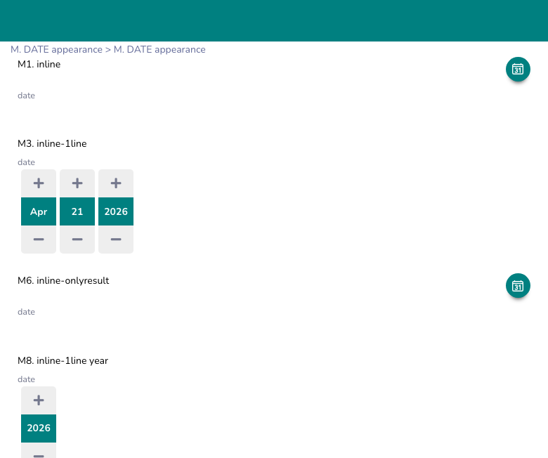
inline — circular button → modal
A circular icon button (calendar or clock) floats next to the question label. Tapping it opens a modal with the picker. After selection, the chosen value appears as text beside the label.
- Button background: primary theme color (overridable)
- Button shape: full circle (
border-radius: 50%)
| type | name       | label         | appearance |
|------|------------|---------------|------------|
| date | start_date | Date of visit | inline     |
inline-onlyresult — button disappears after selection
Same as inline but the button hides itself once a value is selected. Useful when you only want the date visible after it has been picked, without a persistent icon.
inline-onlyresultinline-1line — row of spinners
Renders individual spinner controls (▲ value ▼) in a single horizontal row — one column per component. For date: month / day / year. For datetime: month / day / year / hours / minutes. For time: hours / minutes.
No modal or calendar popup — the user scrolls each spinner independently.
inline-1lineShow only specific components by adding the component names:
inline-1line month year      → hides day spinner
inline-1line year            → shows only year
Limit the year range:
inline-1line y_range(2000-2030)box — text input
Renders a plain text input field. The user types the date directly using the format defined in the appearance.
box(%d/%m/%Y)       → DD/MM/YYYY
box(%Y-%m-%d)       → YYYY-MM-DD
month-year — month and year only
Standard XLSForm appearance. The picker starts at year view; the user selects month and year but not a specific day.
month-yearyear — year only
Standard XLSForm appearance. The picker starts at decade view; only the year is selectable.
yearCustom display format
Append -[format] to any inline appearance to control how the selected value is displayed as text. Uses strftime-style tokens.
| Token | Meaning | Example |
|---|---|---|
%d | Day (zero-padded) | 07 |
%e | Day (no padding) | 7 |
%m | Month number | 04 |
%n | Month number (no padding) | 4 |
%b | Month abbreviation | Apr |
%Y | 4-digit year | 2026 |
%y | 2-digit year | 26 |
%H | Hour (24h) | 14 |
%h | Hour (no padding) | 14 |
%M | Minute | 05 |
%S | Second | 00 |
%a | Day name abbreviation | Wed |
Examples:
inline-[%d/%m/%Y]            → 07/04/2026
inline-[%d %b %Y]            → 07 Apr 2026
inline-1line-[%Y-%m-%d]      → spinner input, formatted display
inline-[%d/%m/%Y %H:%M]      → 07/04/2026 14:30
Color customization
Override the icon button color using colors():
inline colors("0099FF")                   → button background #0099FF
inline colors("0099FF","FFFFFF")          → background #0099FF, icon color #FFFFFF
inline-1line colors("0000FF","FFFF00")    → spinner accent colors
inline-onlyresult colors("E53935")        → red button
Button position with display{}
The display{} modifier controls where the icon button appears relative to the question label. Applies to inline and inline-onlyresult.
display{<align>, <size>, <color>}| Parameter | Values | Default |
|---|---|---|
| Align | left, right, top, center, bottom | right |
| Size | small, medium, large | small |
| Color | hex e.g. #FF5500 | primary theme color |
Align behavior:
| Value | Layout |
|---|---|
right | Button to the right of the label |
left | Button to the left of the label |
top | Button above the label, full-width centered |
center / bottom | Button below the label, full-width centered |
Examples:
inline display{left}
inline display{center, large}
inline display{right, medium, #E53935}
inline-onlyresult display{bottom, large, #0099FF}
Date range restriction
Use inputs{range[...]} to restrict which dates are selectable.
inputs{range[dateGt(2024-01-01), dateLt(2024-12-31)]}Parameters inside range[...]:
| Parameter | Description |
|---|---|
dateGt(YYYY-MM-DD) | Minimum selectable date (greater than or equal) |
dateLt(YYYY-MM-DD) | Maximum selectable date (less than or equal) |
indayTimeGt(HH:MM:SS) | Minimum time within a day (datetime only) |
indayTimeLt(HH:MM:SS) | Maximum time within a day (datetime only) |
Multiple ranges can be defined — a date is selectable if it falls within any of the ranges.
Suppress the label
Add text-nolabel to hide the question label. The button renders alone.
inline text-nolabel display{center, large}Layout summary
| Appearance | Widget rendered | Color customizable |
|---|---|---|
| (none) | Always-open calendar | No |
inline | Circular button → modal calendar | Yes |
inline-onlyresult | Circular button → modal, hides after pick | Yes |
inline-1line | Row of spinners | Yes |
box(%format%) | Text input field | No |
month-year | Month/year picker | No |
year | Year-only picker | No |
Example usage
| type     | name        | label              | appearance                              |
|----------|-------------|--------------------|-----------------------------------------|
| date     | visit_date  | Date of visit      | inline display{right} -[%d/%m/%Y]       |
| date     | birth_date  | Date of birth      | inline-1line y_range(1940-2026)         |
| time     | start_time  | Start time         | inline-1line                            |
| datetime | event_time  | Event date & time  | inline display{center, large} -[%d/%m/%Y %H:%M] |
| date     | report_date | Reporting date     | box(%d/%m/%Y)                           |
Best Practices
- Use
inlinefor compact forms — it saves vertical space compared to the always-open calendar. - Use
inline-1linewhen respondents need to adjust individual date components (e.g. year of birth). - Use
box()only when you trust the enumerator to type dates correctly — no validation UI is shown. - Use
display{center, large}to make the button more prominent on mobile screens. - Always specify
-[format]when the defaultYYYY-MM-DDdisplay would confuse local users. - Be mindful of time zones when collecting datetime data across different regions.
Limitations
inline-1linealways defaults to today's date if no value exists — usedefaultcolumn to pre-fill a specific date.box()format only controls the display; the stored value is always ISO 8601.- Date range restriction (
inputs{range[...]}) does not work with theboxlayout. - Time zone differences can complicate data analysis if not properly accounted for.